₦0.00

We all know the importance of staying hydrated, but have you ever stopped to consider the silent salesman staring back at you from the grocery aisle shelf? Yes, I’m talking about bottled water labels, and their design plays a much bigger role than simply displaying the brand name. Colors, in particular, act as a powerful subconscious influence, guiding our purchasing decisions. So, let’s dive into the fascinating world of color in bottle water label design!
Crystal Clear Communication: Understanding the Basics
First things first, clear and legible information is paramount. A splashy design with unreadable text is a recipe for confusion. However, once the basics are covered, color takes center stage. Here’s a breakdown of some common color choices and the messages they convey:
-
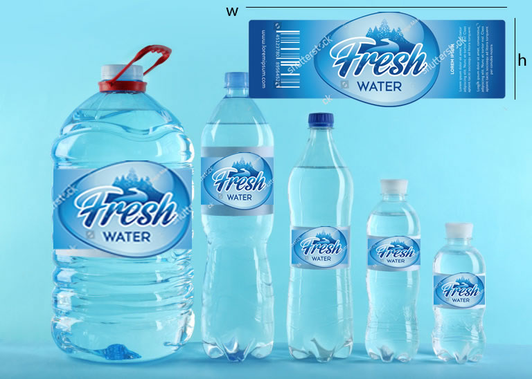
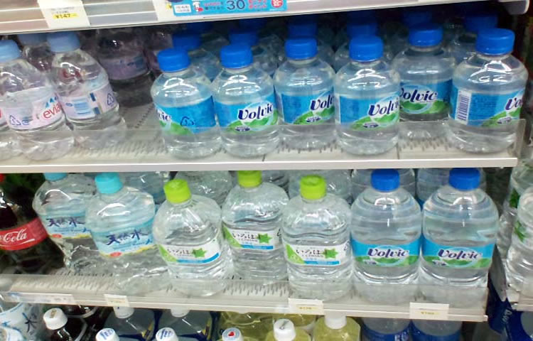
Blue: The undisputed champion of bottled water labels, blue evokes feelings of trust, purity, and refreshment. It subconsciously links the water to its natural source, like a pristine mountain spring.
-
Green: Another symbol of nature, green signifies freshness, health, and vitality. This is a popular choice for brands promoting eco-friendly practices or those infused with natural electrolytes.
-
White: Often used as a base color, white represents cleanliness, simplicity, and purity. It can also create a sense of minimalism and sophistication.
Beyond the Basics: Exploring the Emotional Spectrum
Colors can go beyond basic associations and tap into deeper emotions. For example:
-
Black: While not as common, black can add a touch of luxury and exclusivity to a water brand. However, use it sparingly to avoid creating a sense of mystery or heaviness.
-
Light Blue & Teal: These calming colors evoke feelings of tranquility and relaxation, perfect for water brands targeting health-conscious consumers.
-
Orange & Yellow: These energetic colors can add a touch of vibrancy and fun, potentially appealing to a younger demographic or those seeking a more active lifestyle.
Remember, It’s Not Just About One Color!
Color palettes play a crucial role. For instance, a brand might combine blue with green to emphasize both purity and natural elements. Considering the target audience is also essential. A children’s water brand might opt for bolder, brighter colors, while a high-end water brand might choose a more muted and elegant color scheme.
The Takeaway: Decoding the Label Language
The next time you reach for a bottle of water, take a moment to consider the label design. What colors are used? How do they make you feel? Understanding the language of color in bottle water labels can not only add an extra layer of appreciation to your next purchase, but it can also reveal the brand’s marketing strategy and target audience. So, stay hydrated, and keep those color palettes in mind!